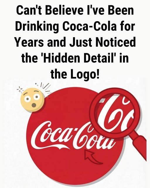
🧠 What People Believe They’ve Spotted in the Coca-Cola Logo
In late 2025, news outlets and social media users started circulating claims about a “hidden message” in the Coca-Cola logo — specifically that one of the letters wasn’t just decorative but meant to communicate something deeper:
Supporters of the idea argue that because Coca-Cola has historically marketed itself around happiness and togetherness (think slogans like “Open Happiness”), this subtle visual cue fits the brand’s message strategy.
This claim got attention on social platforms and was reported by outlets like UNILAD as a kind of “hidden detail people never noticed” — which is exactly the sort of story that drives shares and clicks.
🤔 But Experts and Designers Are Skeptical
Not everyone agrees that there’s a true hidden message in the Coca-Cola logo:
Design critics and branding writers point out that Coca-Cola’s official history and known design evolution make no mention of a deliberate “smile” embedded in the lettering. They argue the logo’s curves are the product of beauty, legibility, and script style, not secret symbolism.
In fact, the Coca-Cola wordmark comes from Spencerian script, a popular 19th-century handwriting style. It was originally hand-written and then formalized over time — not engineered as a hidden message.
Some articles go further and call the “hidden smile” idea design speculation, rather than something Coke intended.
So while people think they see something meaningful, there’s no documented evidence from Coca-Cola’s archives that the logo was designed to contain a secret symbol. Instead, the results come from interpretation and pattern-recognition — something humans are very good (and sometimes over-enthusiastic) at doing.
To understand why people might read into the design, it helps to know a bit of how the logo came to be:
Origins
The Coca-Cola wordmark was created in 1887 by Frank M. Robinson, a bookkeeper who also suggested the name Coca-Cola.
Continue reading…
